Design Challenge: Vitality and Growth for the Actiiv Brand - Harnessing the Power of Plants with Science
Actiiv wanted to bring its brand presence to the next level. We needed to find the best “visual voice” to establish it as a source of clean, science-backed beauty solutions for targeting hair loss. The look needed to be able to expand easily into other products in the health and wellness sector while appealing across genders and ages. The formulas are rich in botanicals and highly targeted, giving them a high price point, which also needed to be conveyed in an elevated packaging experience. Custom packaging was developed to give the brand a stand-out presence while remaining clean, quiet, and effective appearing.


Bio-sculptural forms fit softly in the hand, while a crisp edge ‘slice’ reveals the silhouette of a science beaker.
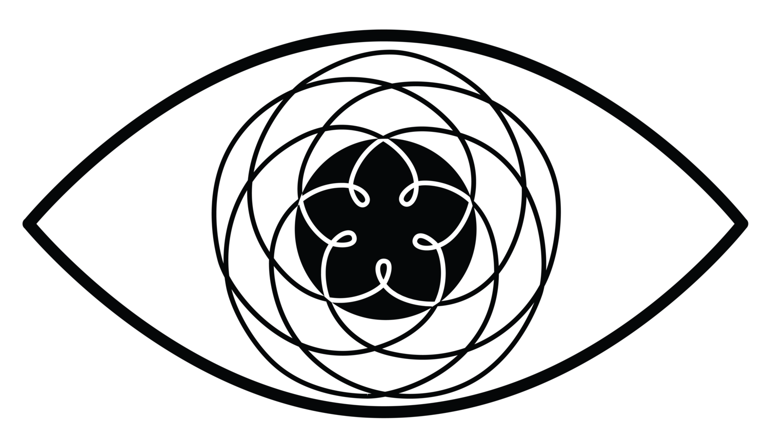
The Actiiv logotype was updated to evoke strength and action, and an iconic logomark was added that combines the letter “A” with symbolic geometry representative of elements that make up the brand message.

The bottles are made of post-consumer recycled plastic. The flip-caps merge into the form and can be used with one hand.

The visual language of the packaging continues onto secondary cartons using soft touch and spot gloss finishes that echo the science beaker shape from the bottle. A series of icons are used to convey the product's benefits and values.

The color palette is soft and muted, inspired by plant-based pigments and aligning with a natural feel. The overall brand tone is meant to be calm and humanistic. A custom shelf display unit holds the product line in place and creates an educational shopping experience where you can learn about the key plant ingredients.


This project was in collaboration with Mojo Product Design


